


Introduction
In the previous issue, we discussed how to handle the most basic univariate data.
This article discusses scatter plots and scatter matrix as basic ways to handle multivariate data, and correlation coefficient, rank correlation coefficient, and variance-covariance matrix as summarization methods.
The program used is described in python and it can be tried in Google Colab below.

\begin{align*} \newcommand{\mat}[1]{\begin{pmatrix} #1 \end{pmatrix}} \newcommand{\f}[2]{\frac{#1}{#2}} \newcommand{\pd}[2]{\frac{\partial #1}{\partial #2}} \newcommand{\d}[2]{\frac{{\rm d}#1}{{\rm d}#2}} \newcommand{\T}{\mathsf{T}} \newcommand{\(}{\left(} \newcommand{\)}{\right)} \newcommand{\{}{\left\{} \newcommand{\}}{\right\}} \newcommand{\[}{\left[} \newcommand{\]}{\right]} \newcommand{\dis}{\displaystyle} \newcommand{\eq}[1]{{\rm Eq}(\ref{#1})} \newcommand{\n}{\notag\\} \newcommand{\t}{\ \ \ \ } \newcommand{\tt}{\t\t\t\t} \newcommand{\argmax}{\mathop{\rm arg\, max}\limits} \newcommand{\argmin}{\mathop{\rm arg\, min}\limits} \def\l<#1>{\left\langle #1 \right\rangle} \def\us#1_#2{\underset{#2}{#1}} \def\os#1^#2{\overset{#2}{#1}} \newcommand{\case}[1]{\{ \begin{array}{ll} #1 \end{array} \right.} \newcommand{\s}[1]{{\scriptstyle #1}} \definecolor{myblack}{rgb}{0.27,0.27,0.27} \definecolor{myred}{rgb}{0.78,0.24,0.18} \definecolor{myblue}{rgb}{0.0,0.443,0.737} \definecolor{myyellow}{rgb}{1.0,0.82,0.165} \definecolor{mygreen}{rgb}{0.24,0.47,0.44} \newcommand{\c}[2]{\textcolor{#1}{#2}} \newcommand{\ub}[2]{\underbrace{#1}_{#2}} \end{align*}
How to draw a scatter plot
We will again use the iris dataset as the data to be handled. iris dataset consists of petal (petal) and gak (sepal) lengths of three varieties: Versicolour, Virginica, and Setosa.
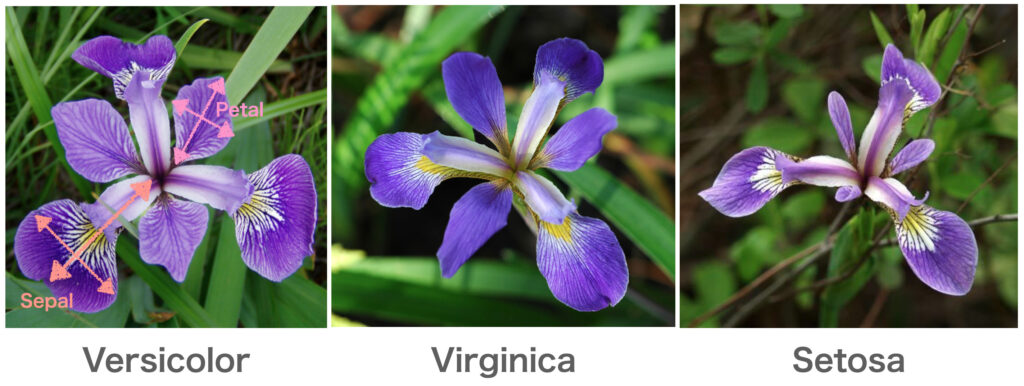
First, as bivariate data, we will restrict the variety to Setosa and deal only with sepal_length and sepal_width.
Now we will import the iris dataset in python.
import numpy as np
import pandas as pd
import seaborn as sns
import scipy.stats as st
import matplotlib.pyplot as plt

df_iris = sns.load_dataset('iris')

sepal_length = df_iris[df_iris['species']=='setosa']['sepal_length']
sepal_width = df_iris[df_iris['species']=='setosa']['sepal_width']
The most basic way to visually see the relationship between sepal_length and sepal_width is to draw a scatter plot.
To draw a scatterplot, use the scatterplot function in the seaborn library.
sns.scatterplot(x=sepal_length, y=sepal_width)
plt.show()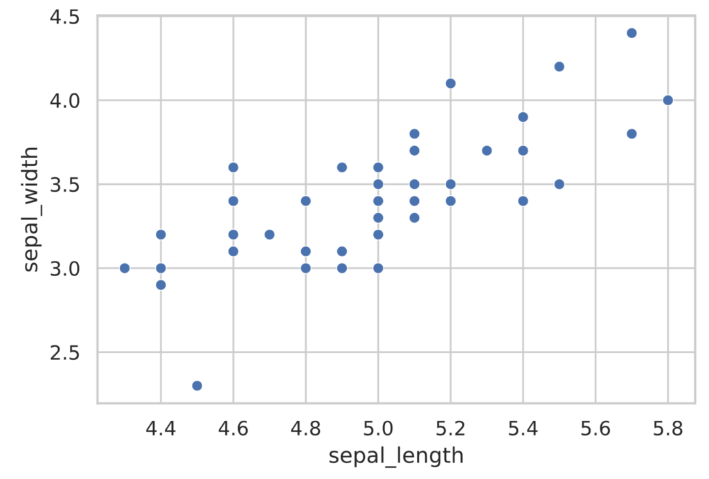
The scatterplot in the figure above shows that the points are aligned rightward. This means that flowers with larger sepal_length tend to have larger sepal_width.
The seaborn library also has a jointplot function that depicts a histogram along with a scatterplot.
sns.jointplot(x=sepal_length, y=sepal_width)
plt.show()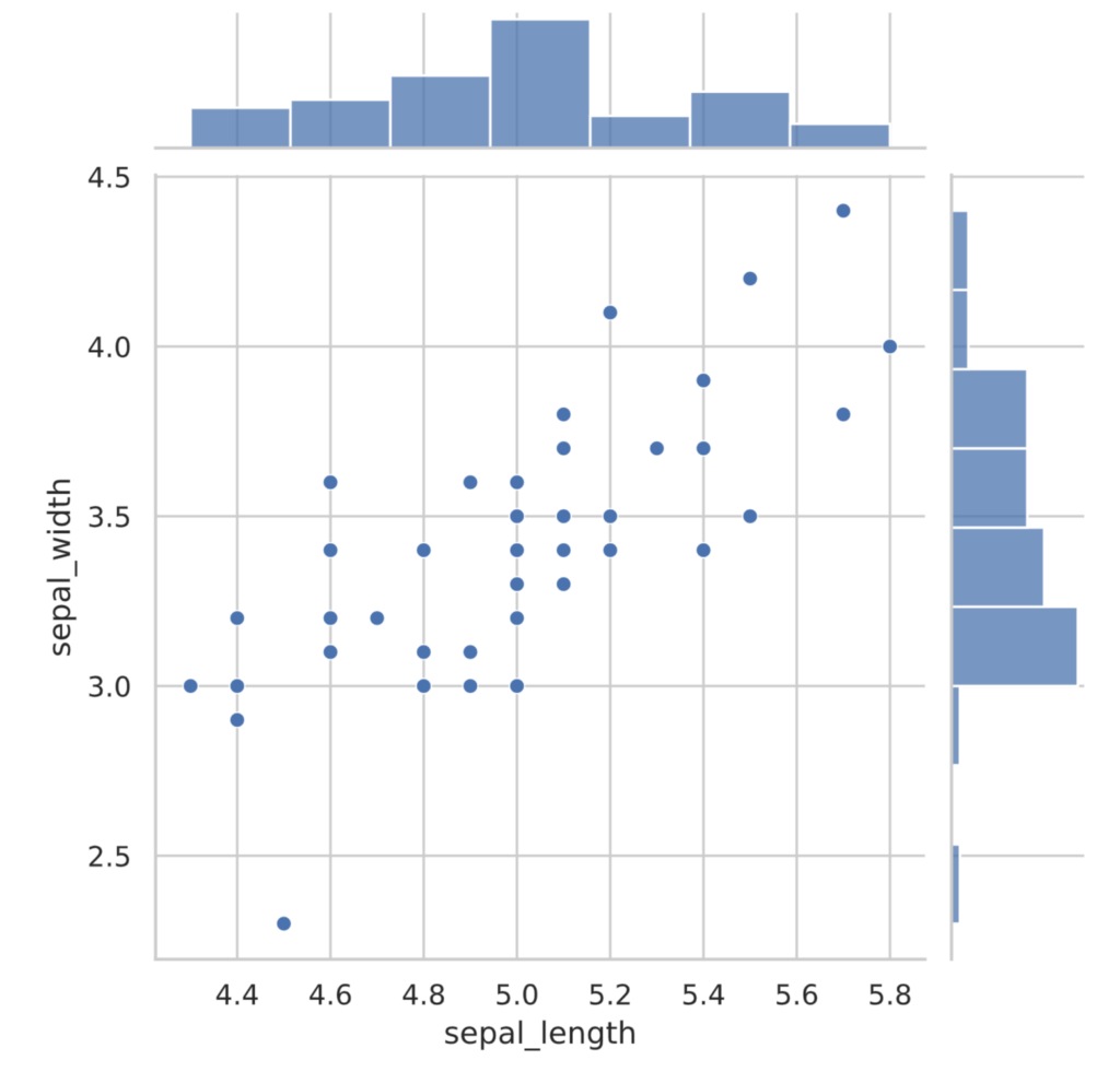
correlation coefficient
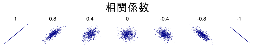
Correlation coefficients (Pearson’s product-moment correlation coefficient) are often used to identify “rightward” or “downward” trends between data; the correlation coefficient between two variables $x$ and $y$ takes values ranging from $-1$ to $1$, where $x$ tends to increase as $y$ increases. It takes a positive value when $x$ tends to increase and a negative value when $y$ tends to decrease.
There is a positive correlation between $x$ and $y$ when the correlation coefficient is close to $1$, a negative correlation when close to $-1$, and no correlation when close to $0$.
The correlation coefficient $r_{xy}$ is defined as
\begin{align*} r_{xy} = \f{\sum_{i=1}^n (x^{(i)} – \bar{x}) (y^{(i)} – \bar{y}) }{\sqrt{\sum_{i=1}^n (x^{(i)} – \bar{x})^2} \sqrt{\sum_{i=1}^n (y^{(i)} – \bar{y})^2}}. \end{align*}
where as the mean deviation vector
\begin{align*} \bm{x} &= (x^{(1)} – \bar{x}, x^{(2)} – \bar{x}, \dots, x^{(n)} – \bar{x})^\T, \n \bm{y} &= (y^{(1)} – \bar{y}, y^{(2)} – \bar{y}, \dots, y^{(n)} – \bar{y})^\T \end{align*}
The correlation coefficient $R_{xy}$ coincides with the cosine $\cos \theta$ of the angle $\theta$ between the vectors $\bm{x}, \bm{y}$. \begin{align*} r_{xy} = \cos \theta = \f{\bm{x}^\T \bm{y}}{\|\bm{x}\| \|\bm{y}\|}. \end{align*}
From this we see that $-1 \leq r_{xy} \leq 1$.
Also, if there is a positive correlation, $\bm{x}, \bm{y}$ point in the same direction, and if there is no correlation, $\bm{x}, \bm{y}$ can be interpreted as pointing in orthogonal directions.
The numerator of the defining formula for the correlation coefficient divided by the number of samples $n$ is called the covariance of $x, y$.
\begin{align*} \sigma_{xy} = \f{1}{n} \sum_{i=1}^n (x^{(i)} – \bar{x}) (y^{(i)} – \bar{y}) \end{align*}
Using this value and the standard deviation $\sigma_x, \sigma_y$ of $x, y$, the correlation coefficient can be expressed as
\begin{align*} r_{xy} = \f{\sigma_{xy}}{\sigma_x \sigma_y} \end{align*}
When the correlation coefficient is $r_{xy} = \pm 1 $, there is a linear relationship between $x, y$. The proof is given below.
Proof
In the following, the variance $\sigma_x^2, \sigma_y^2$ of $x, y$ is not $0$.
If $R_{xy}$ is $1$ or $-1$, then the cosine $\cos \theta$ of the angle $\theta$ between the mean deviation vectors $\bm{x}, \bm{y}$ is $1$ or $-1$. Therefore,
\begin{align*} \bm{y} = \gamma \bm{x} \end{align*}
There exists a constant $\gamma \neq 0$ satisfying $\gamma$ (if $r_{xy}=1$, $\gamma$ is positive, if $r_{xy}=-1$, $\gamma$ is negative). From this, $(y^{(i)} – \bar{y}) = \gamma (x^{(i)} – \bar{x}), \ (i = 1, \dots, n)$. In other words, $x, y$ have a linear relationship.
Also, taking the average of the squares of both sides in the above equation, we obtain
\begin{align*} \f{1}{n}\sum_{i=1}^n (y^{(i)} – \bar{y})^2 &= \gamma^2 \f{1}{n}\sum_{i=1}^n (x^{(i)} – \bar{x})^2 \n \therefore \sigma_y^2 &= \gamma^2 \sigma_x^2. \end{align*}
Therefore, $\gamma = \pm \sqrt{\sigma_y^2 / \sigma_x^2}$ and the following linear relationship holds for $x, y$.
\begin{align*} y = \pm \sqrt{\f{\sigma_y^2}{\sigma_x^2}} (x – \bar{x}) + \bar{y}. \end{align*}
The sign of the slope is the same as the sign of $r_{xy}$.
In python, the correlation coefficient can be calculated as follows
corr = np.corrcoef(sepal_length, sepal_width)[0, 1]
print(f'correlation coefficient: {corr}')
# Output
correlation coefficient: 0.7425466856651597One caveat to the correlation coefficient is that it is valid when the two variables are in a linear relationship, but not when they are not (in the case of a non-linear relationship). In fact, as shown in the figure below, for data with a relationship other than a linear relationship, the correlation coefficient will determine that there is “no correlation” and will not work effectively.
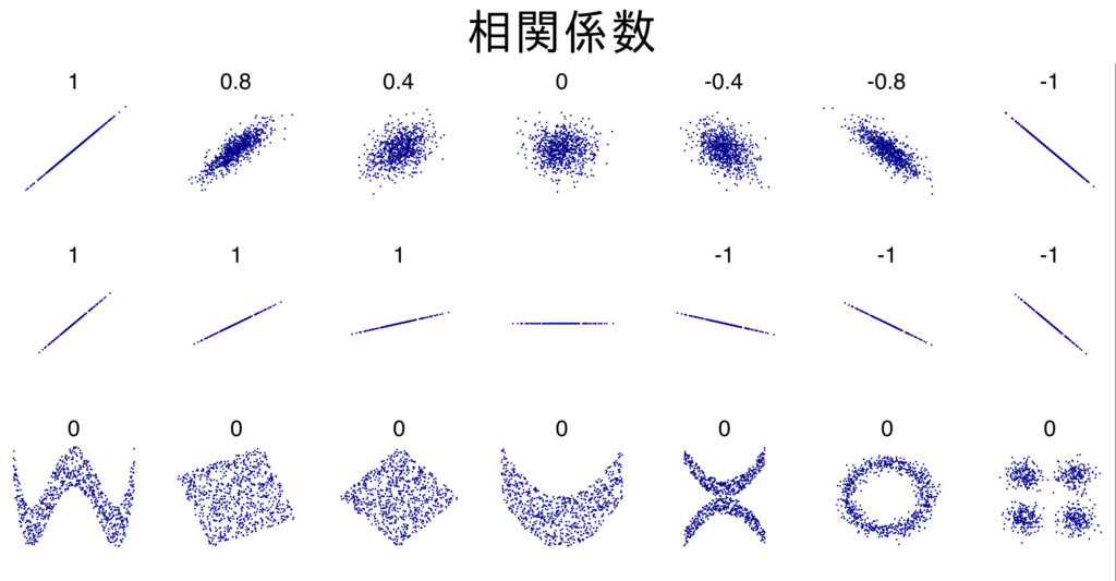
Thus, the correlation coefficient is a quantitative expression of how close a linear relationship is; “correlated” is different from “there is a relationship between the data.
Another point to note is the phenomenon that when the data is truncated, the correlation coefficient approaches $0$ compared to the original data. As an example, the correlation coefficient between pre-enrollment grades and post-enrollment grades is inherently positive, but since we can observe post-enrollment grades only for accepted students and have no data for those who did not enroll, the correlation coefficient becomes low.
This phenomenon is called the cutting or selection effect.
rank correlation coefficient
In addition to the correlation coefficient just mentioned (Pearson’s product-moment correlation coefficient), various other correlation coefficients are known. Here we discuss Spearman’s rank correlation coefficient.
The rank correlation coefficient is valid when only the rank of the data is known. For example, if we only know the ranks of the following achievement tests.
| Math test rankings. | Physics test rankings. |
|---|---|
| 1 | 1 |
| 3 | 4 |
| 2 | 2 |
| 4 | 5 |
| 5 | 3 |
| 6 | 6 |
The order correlation coefficient is the one that captures the correlation using only the order of such data.
If we denote the order of the observed values $x and y$ as $\tilde{x} and \tilde{y}$, respectively, as shown in the following table,
| $x$ rank. | $y$ rank. |
|---|---|
| $\tilde{x}^{(1)}$ | $\tilde{y}^{(1)}$ |
| $\tilde{x}^{(2)}$ | $\tilde{y}^{(2)}$ |
| $\vdots$ | $\vdots$ |
| $\tilde{x}^{(n)}$ | $\tilde{y}^{(n)}$ |
Spearman’s rank correlation coefficient $\rho_{xy}$ is calculated by:
\begin{align*} \rho_{xy} = 1\ – \f{6}{n(n^2-1)} \sum_{i=1}^n (\tilde{x}^{(i)}\ – \tilde{y}^{(i)})^2. \end{align*}
For more information on why this formula is used, please see the following article.
In python, you can do this:
math = [1, 3, 2, 4, 5, 6]
phys = [1, 4, 2, 5, 3, 6]

corr, pvalue = st.spearmanr(math, phys)
print(corr)
# Outputs
0.8285714285714287Description of data over 3 Variables: scatter plot matrix and variance-covariance matrix.
When the data is more than three variables, it becomes difficult to draw a scatter plot using all the variables. So, let’s use a scatter plot matrix that displays two pairs of scatter plots of each variable side by side on a panel.
Let’s draw a scatter plot matrix using the four variables from the iris data set. Python uses the pairplot function of the seaborn library.
df_setosa = df_iris[df_iris['species']=='setosa']  # 品種はSetosaに限定する
sns.pairplot(data=df_setosa)
plt.show()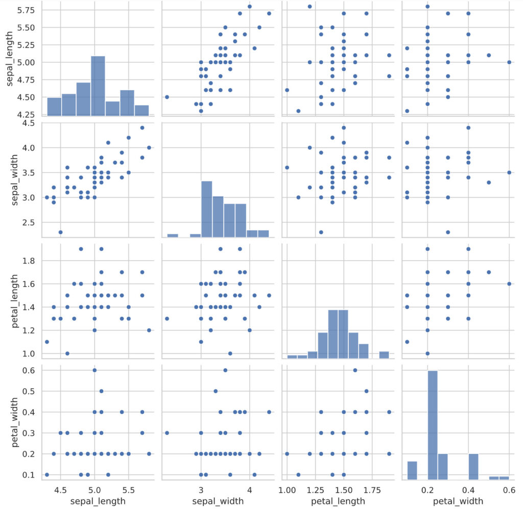
By looking at the scatter plot matrix in this way, we can capture the relationship between each variable at once.
The correlation coefficients are also grouped together in a matrix format. As a general argument, consider the data of a $m$ variable with a sample size of $n$. In this case, the matrix $\tilde{X}$ is defined below.
\begin{align*} \tilde{X} = \mat{ x_1^{(1)} – \bar{x}_1 & x_2^{(1)} – \bar{x}_2 & \cdots & x_m^{(1)} – \bar{x}_m \\ x_1^{(2)} – \bar{x}_1 & x_2^{(2)} – \bar{x}_2 & \cdots & x_m^{(2)} – \bar{x}_m \\ \vdots & \vdots & \ddots & \vdots \\ x_1^{(n)} – \bar{x}_1 & x_2^{(n)} – \bar{x}_2 & \cdots & x_m^{(n)} – \bar{x}_m }. \end{align*}
Then, the matrix $\Sigma$, called the variance-covariance matrix, is given by.
\begin{align*} \Sigma = \f{1}{n} \tilde{X}^\T \tilde{X}. \end{align*}
Here, the $(i, j)$ component of the variance-covariance matrix, $\sigma_{ij}$, is defined as follows.
\begin{align*} \sigma_{ij} = \f{1}{n} \sum_{k=1}^n (x^{(k)}_i – \bar{x}_i) (x^{(k)}_j – \bar{x}_j) \end{align*}
$\sigma_{ij}$ is the covariance of the $i$ and $j$ variables. In particular, the diagonal component is the variance of the $i$ variable.
Similarly, the target matrix $R$ whose $(i, j)$ component is the correlation coefficient (Pearson’s product-moment correlation coefficient) $r_{ij}$ of the $i$ and $j$ variables is called a correlation matrix.
\begin{align*} R = \mat{ 1 & r_{11} & \cdots & r_{1m} \\ r_{11} & 1 & \cdots & r_{2m} \\ \vdots & \vdots & \ddots & \vdots \\ r_{m1} & r_{m2} & \cdots & 1 }. \end{align*}
In python, the correlation matrix can be computed as follows:
corr_mat = df_setosa.corr()
corr_mat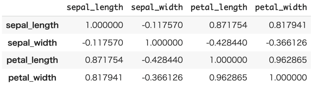
Correlation matrices are easier to understand using heatmaps.
cmap = sns.diverging_palette(255, 0, as_cmap=True)  # カラーパレットの定義
sns.heatmap(corr_mat, annot=True, fmt='1.2f', cmap=cmap, square=True, linewidths=0.5, vmin=-1.0, vmax=1.0)
plt.show()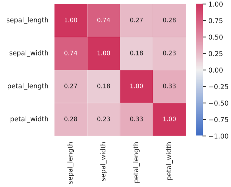
Next time: ▼Events, probabilities and random variables.