


Introduction
In the previous issue, we introduced various evaluation metrics for machine learning classification problems, including the confusion matrix.

In this issue, we continue with the ROC curve and AUR, which are commonly used to evaluate classifiers.
Note that the program code described in this article can be tried in the following google colab.

Machine learning evaluation metrics TPR, FPR
The ROC curve uses TPR (true positive rate (= recall)) and FPR (false positive rate); let’s review these two first before we start talking about the ROC curve.
Consider classifying data as “+ (positive) or – (negative)”.
When the classifier is fed test data and allowed to make inferences, four patterns arise
True Positive (TP): Infer + for data whose true class is +.
False Negative (FN): Infer data whose true class is + as –.
False Positive (FP): Infer data with a true class of – as +.
True negative (TN): Infer data with true class – as –.
The results of this classification are summarized in the following table, which is called the confusion matrix.
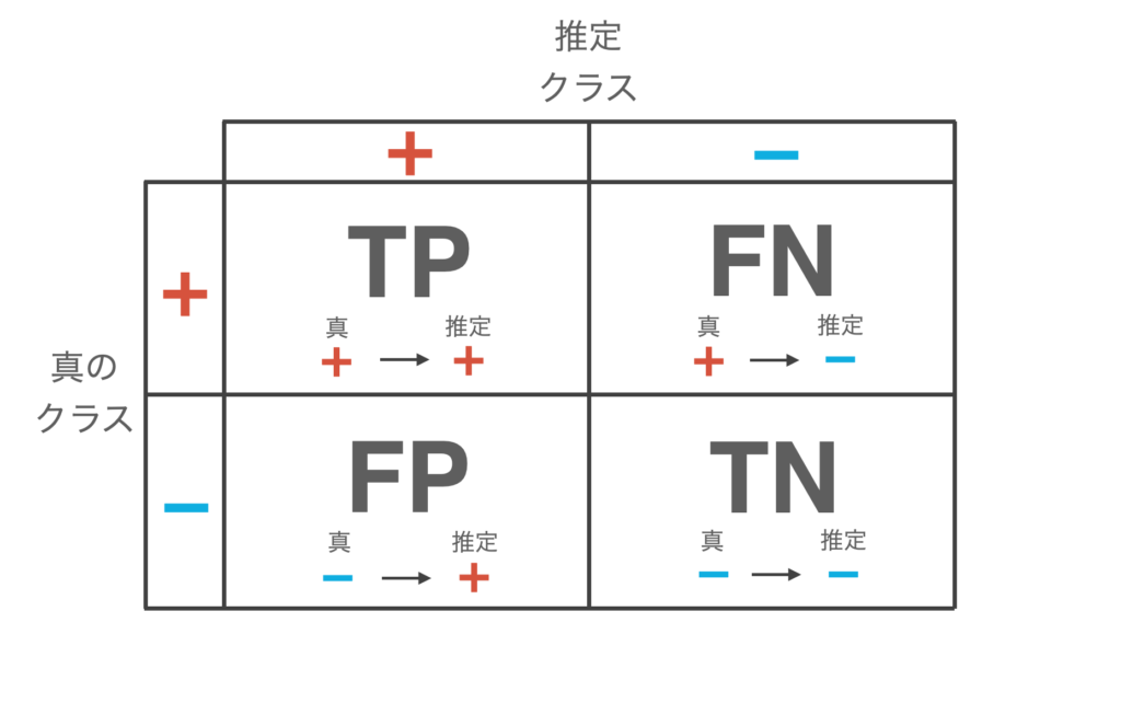
where TPR and FPR are defined by the following equations
\begin{align*}
{\rm TPR} = \frac{{\rm TP}}{{\rm TP} + {\rm FN}}, \ \ \ \ {\rm FPR} = \frac{{\rm FP}}{{\rm TN} + {\rm FP}}
\end{align*}
TPR is a measure of how much of the total + (positive) data the classifier correctly infers as + (positive).
FPR is a measure of how much of the total – (negative) data the classifier incorrectly infers as + (positive).
As mentioned in the introduction, the ROC curve, which is the main topic of this issue, is an evaluation index for classifiers calculated based on TPR and FPR, which have the above characteristics.
ROC curve and AUR
Some classifiers output a probability of being + when classifying data as + or -. A typical example is logistic regression.
We will call the probability that the classifier’s output is + the “score”.
Normally, data are classified with a threshold value of 0.5, such as “+ if the score is 0.5 or higher, – if the score is less than 0.5,” and so on. Changing this threshold value will naturally change the data classification results, which in turn changes the performance of the classifier (TPR and FPR).
The ROC curve is a plot of FPR on the horizontal axis and TPR on the vertical axis when the threshold is varied.
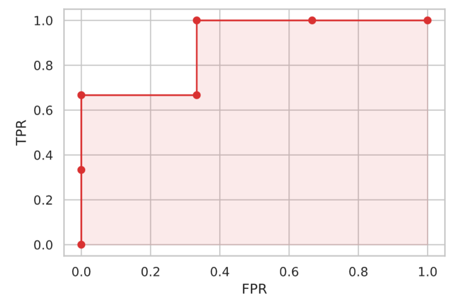
Let’s look at the ROC curve using a specific example.
In the problem of classifying data as + or -, suppose a classifier yields the following scores
| True class | score |
|---|---|
+ | 0.8 |
+ | 0.6 |
+ | 0.4 |
− | 0.5 |
− | 0.3 |
− | 0.2 |
▲ true class and the score output by the classifier (probability of being +)
where the threshold $x$: “+ if the score is above $x$, – if the score is below $x$” is the value of each score output by the discriminator, and the TPR and FPR are calculated at each threshold value.
For example, for the threshold $x = 0.8$ the confusion matrix is
Predict + | Predict − | |
true + | TP: 1 | FN: 2 |
true − | FP: 0 | TN: 3 |
\begin{align*}
{\rm TPR} = \frac{1}{1+2} = 0.33\cdots, \ \ \ \ {\rm FPR} = \frac{0}{3 + 2} = 0
\end{align*}
The results of this calculation of TPR and FPR for the threshold $x \in \{ 0.8, 0.6, 0.4, 0.5, 0.3, 0.2 \}$ are as follows
| True class | score | TPR | FPR |
|---|---|---|---|
+ | 0.8 | 0.33 | 0 |
+ | 0.6 | 0.66 | 0 |
− | 0.5 | 0.66 | 0.33 |
+ | 0.4 | 1.0 | 0.33 |
− | 0.3 | 1.0 | 0.66 |
− | 0.2 | 1.0 | 1.0 |
Plotting this TPR and FPR produces the ROC curve.
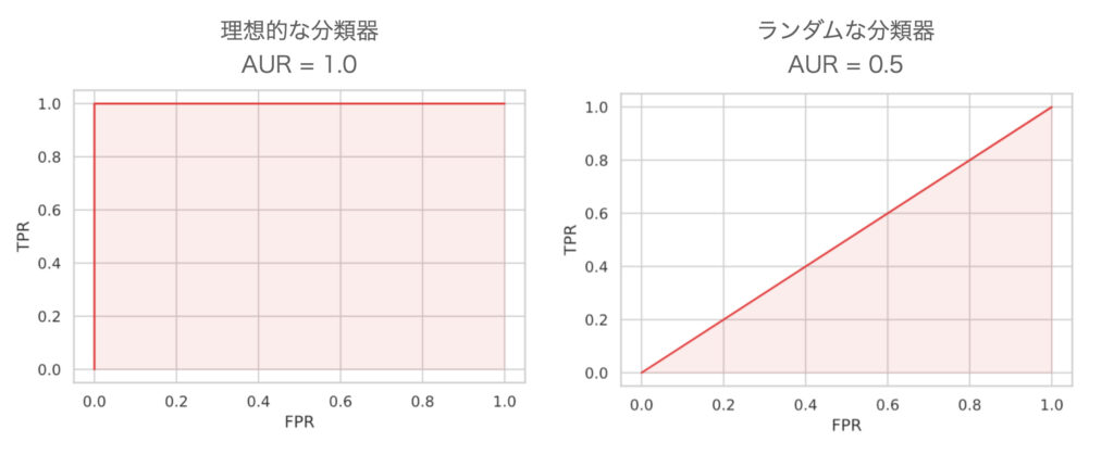
Now, let’s evaluate the classifier using the ROC curve. A good classifier is one that can correctly classify the data into + and – at a certain threshold value. In other words, it is a classifier that can increase TPR without increasing FPR.
This state of increasing TPR without increasing FPR is indicated by the upper left point in the above figure. In other words, the closer the ROC curve is to the upper left, the better the classifier.
On the other hand, what happens to a “bad classifier” (i.e., a classifier that outputs + and – randomly), the + and – will be in the same proportion no matter how the threshold is determined. This means that as the TPR increases, so does the FPR, and the ROC curve becomes a straight line from the origin (0.0, 0.0) to the upper right (1.0, 1.0).
AUR (Area Under Curve) is an index that quantifies such “ROC curve is closer to the upper left. This is defined as the area under the ROC curve, with a maximum value of 1.0. In other words, the closer the AUR is to 1.0, the better the classifier.
Plotting ROC curves in python
ROC curves can be easily plotted using scikit-learn’s roc_curve function. The AUR can also be calculated with the roc_auc_score function.
In this article, we will build two types of models, logistic regression and random forests, and compare their performance with ROC curves and AURs.
- First, the data for the binary classification problem is prepared and divided into training and test data.
import numpy as np
import pandas as pd
import matplotlib.pyplot as plt
import seaborn as sns
from IPython.display import display
from sklearn.datasets import load_breast_cancer

bc = load_breast_cancer()
df = pd.DataFrame(bc.data, columns=bc.feature_names)
df['target'] = bc.target

X = df.drop(['target'], axis=1).values
y = df['target'].values
from sklearn.model_selection import train_test_split
X_train, X_test, y_train, y_test = train_test_split(X, y, test_size=0.3, random_state=1, stratify=y)- Create a logistic regression model and a random forest model.
from sklearn.linear_model import LogisticRegression
from sklearn.ensemble import RandomForestClassifier

model_lr = LogisticRegression(C=1, random_state=42, solver='lbfgs')
model_lr.fit(X_train, y_train)


model_rf = RandomForestClassifier(random_state=42)
model_rf.fit(X_train, y_train)- The test data are used to predict probabilities, depict ROC curves, and calculate AURs.
from sklearn.metrics import roc_curve, roc_auc_score

proba_lr = model_lr.predict_proba(X_test)[:, 1]
proba_rf = model_rf.predict_proba(X_test)[:, 1]

fpr, tpr, thresholds = roc_curve(y_test, proba_lr)
plt.plot(fpr, tpr, color=colors[0], label='logistic')
plt.fill_between(fpr, tpr, 0, color=colors[0], alpha=0.1)

fpr, tpr, thresholds = roc_curve(y_test, proba_rf)
plt.plot(fpr, tpr, color=colors[1], label='random forestss')
plt.fill_between(fpr, tpr, 0, color=colors[1], alpha=0.1)

plt.xlabel('FPR')
plt.ylabel('TPR')
plt.legend()
plt.show()

print(f'Logistic regression AUR: {roc_auc_score(y_test, proba_lr):.4f}')
print(f'Random forest AUR: {roc_auc_score(y_test, proba_rf):.4f}')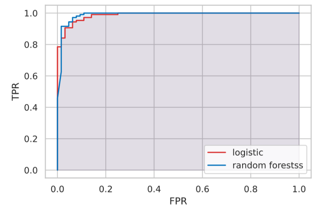
# Output
Logistic regression AUR: 0.9870
Random forest AUR: 0.9885
The results showed that the AUR was close to 1.0 in both cases, and there was not much difference between the two.
(In terms of this result, it is difficult to determine which one is better in terms of AUR because both are very close in value ……)