


Introduction
This course deals with “univariate data,” the foundation of statistics, which refers to data consisting of a single type of variable, such as height data or math exam scores.
This article describes how to create summary statistics such as mean and variance, histograms and box-and-whisker plots to visually capture characteristics of univariate data.
The program used is described in python and it can be tried in Google Colab below.

How to handle univariate data
We will use the iris dataset, which consists of petal and sepal lengths of three varieties: Versicolour, Virginica, and Setosa.
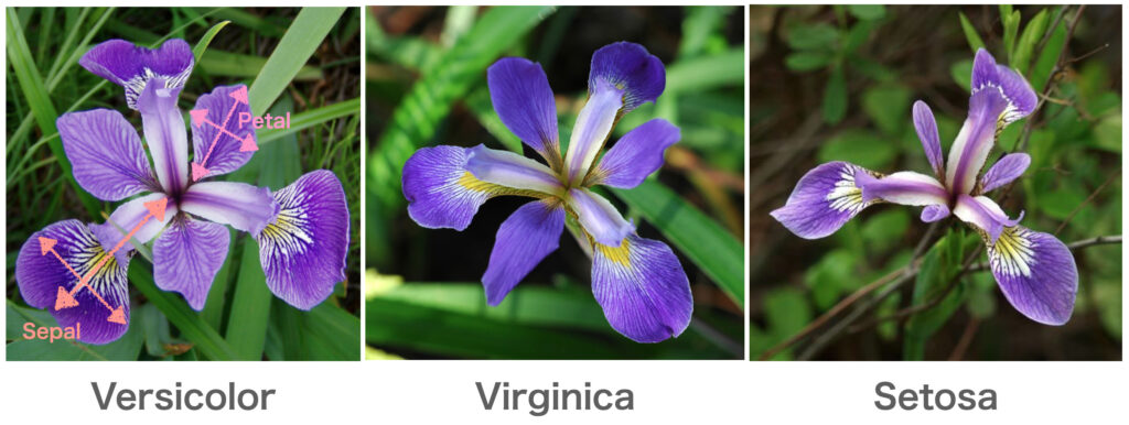
In this case, since we will treat the data as univariate data, we will limit the variety to Setosa and treat only sepal_length.
Now we will import the iris dataset in python.
import numpy as np
import pandas as pd
import seaborn as sns
import scipy.stats as st
import matplotlib.pyplot as plt
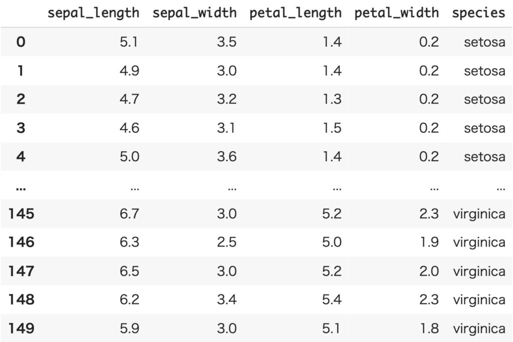
df_iris = sns.load_dataset('iris')
iris_data = df_iris[df_iris['species']=='setosa']['sepal_length']
print(iris_data)# Output
[5.1, 4.9, 4.7, 4.6, 5.0, 5.4, 4.6, 5.0, 4.4, 4.9, 5.4, 4.8, 4.8, 4.3, 5.8, 5.7, 5.4, 5.1, 5.7, 5.1, 5.4, 5.1, 4.6, 5.1, 4.8, 5.0, 5.0, 5.2, 5.2, 4.7, 4.8, 5.4, 5.2, 5.5, 4.9, 5.0, 5.5, 4.9, 4.4, 5.1, 5.0, 4.5, 4.4, 5.0, 5.1, 4.8, 5.1, 4.6, 5.3, 5.0]
Since it is difficult to grasp the characteristics of the data by looking at a list of data, a histogram is depicted.
A histogram is a bar graph with frequency (or relative frequency) on the vertical axis and class on the horizontal axis, and is drawn using the displot function in the seaborn library.
sns.displot(iris_data)
plt.show()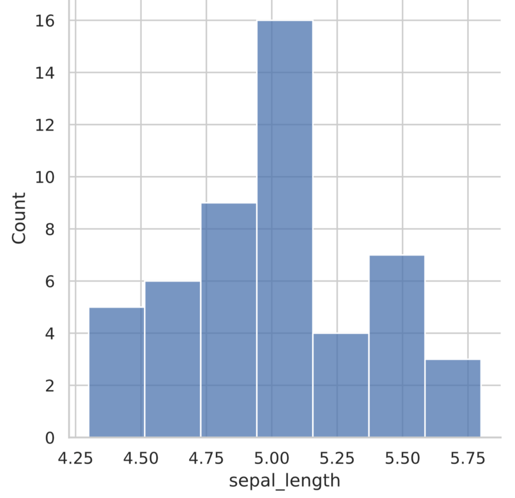
In this histogram, the horizontal axis is sepal_length (cm) in 0.25 cm increments. Each of these increments is called a class, and the width of the increment is called the width of the class, while the number of classes is called the number of classes. The vertical axis is called the frequency, and counts the number of data that fit the class.
The displot function can also be used to display the vertical axis as a percentage of the total as 1 = relative frequency. To do so, pass stat=’probability’ as an argument.
sns.displot(iris_data, stat='probability')
plt.show()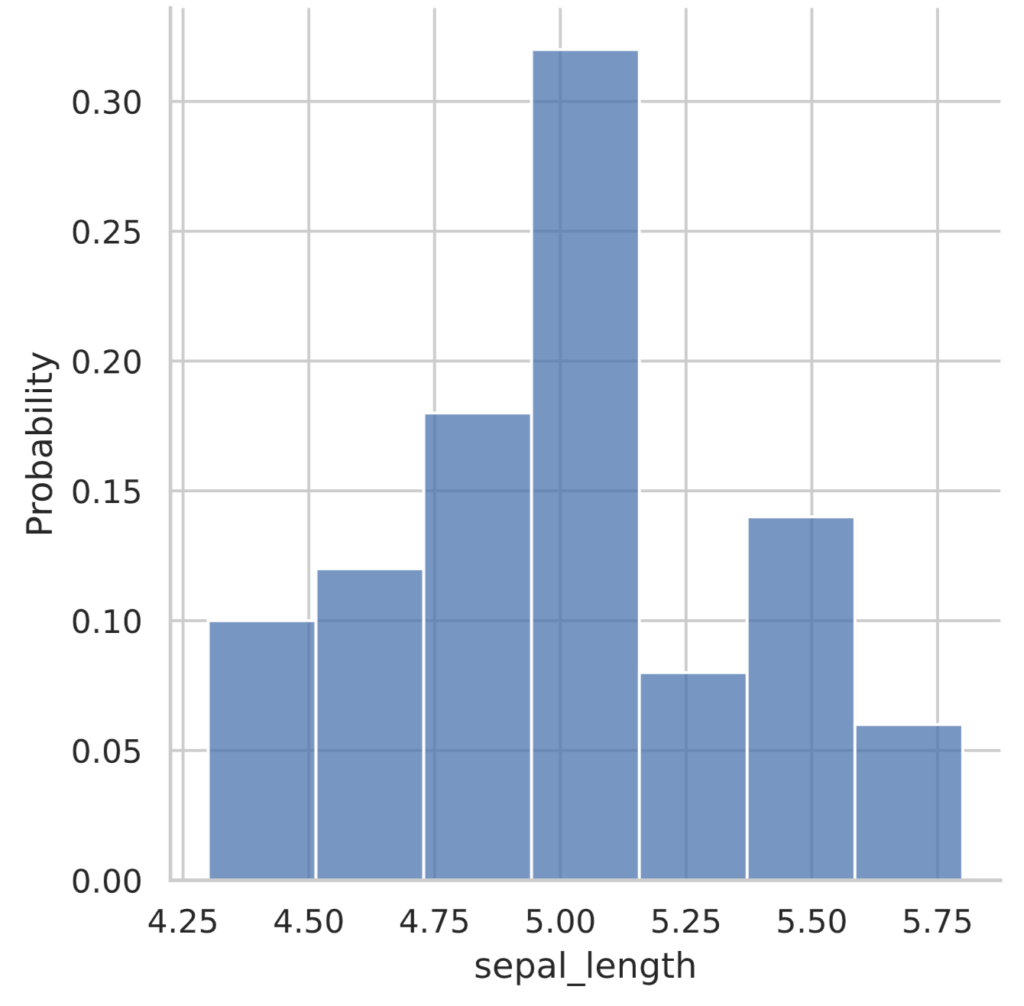
How to determine the number of classes in a histogram
The shape of a histogram can be changed by changing the number of classes and the width of the classes. Too many or too few ranks will not capture the characteristics of the data well.
By default, the seaborn library’s displot function uses something called the Sturges formula to determine the number of classes. It states that the number of classes $k$ can be determined for a given number of samples $n$ by
\begin{align*} k = \lceil 1 + \log_2 n \rceil \end{align*}
where $\lceil x \rceil$ means an integer rounded up to the decimal point of the real number $x$.
For example, since the data we are dealing with has a sample size of 50, we can apply the Sturgess formula
\begin{align*} k = \lceil 1 + \log_2 50 \rceil = \lceil 1 + 5.6438 \rceil = \lceil 6.6438 \rceil = 7 \end{align*}
If you check the histogram shown earlier, you will see that the number of classes is indeed 7.
To change the number of grades in the seaborn library’s displot function, pass bins={grade number} as an argument.
sns.displot(iris_data, bins=10)
plt.show()
Offer Statistics
To capture the data, it is useful to calculate the mean $\bar{x}$, standard deviation $\sigma$ and variance $\sigma^2$.
The average $\bar{x}$ is calculated by
\begin{align*} \bar{x} = \sum_{i=1}^n x^{(i)}. \end{align*}
Also, the variance $\sigma^2$ and standard deviation $\sigma$ are given below.
\begin{align*} \sigma^2 = \frac{1}{n} \sum_{i=1}^n (x^{(i)} – \bar{x})^2, \end{align*}
\begin{align*} \sigma = \sqrt{\frac{1}{n} \sum_{i=1}^n (x^{(i)} – \bar{x})^2}. \end{align*}
However, statistics usually uses unbiased variance.
\begin{align*} \tilde{\sigma}^2 = \frac{1}{n-1} \sum_{i=1}^n (x^{(i)} – \bar{x})^2 \end{align*}
As we will discuss in detail another time, we believe that the variance divided by $n$ tends to estimate the true variance smaller, so the denominator is balanced by the smaller denominator.
The mean corresponds to the center of gravity of the data, and the standard deviation (variance) expresses how scattered the data are around the mean.
A number that summarizes the characteristics of the data is called a summary statistic.
The above values can be calculated in python as follows
print(f'mean: {np.mean(iris_data)}')
print(f'var: {np.var(iris_data)}')
print(f'std: {np.std(iris_data)}')
print(f'unbiased vat: {st.tvar(iris_data)}')
# Output
mean: 5.005999999999999
var: 0.12176399999999993
std: 0.348946987377739
unbiased vat: 0.12424897959183677quantile and box-and-whisker diagram
The data are ordered from smallest to largest, and the value exactly at the halfway point is called the median, or median.
Values exactly $1/4$ (25%) and $3/4$ (75%) from the smaller end, rather than exactly half, are also used as summary statistics. They are called the first quartile (25% point) (Q1) and the third quartile (75% point) (Q3), respectively.
In python it can be calculated as follows
print(f'median: {np.median(iris_data)}')

print(f'quantile: {np.quantile(iris_data, q=[0.25, 0.5, 0.75])}')
# Output
median: 5.0
quantile: [4.8 5. 5.2]The difference between the 75th and 25th percentile points, $Q3 – Q1$, is called the interquartile range deviation (IQR) and indicates how much data is concentrated around the median.
This can be depicted in a box-and-whisker diagram using the boxplot function in the seaborn library.
sns.boxplot(y=iris_data)
plt.show()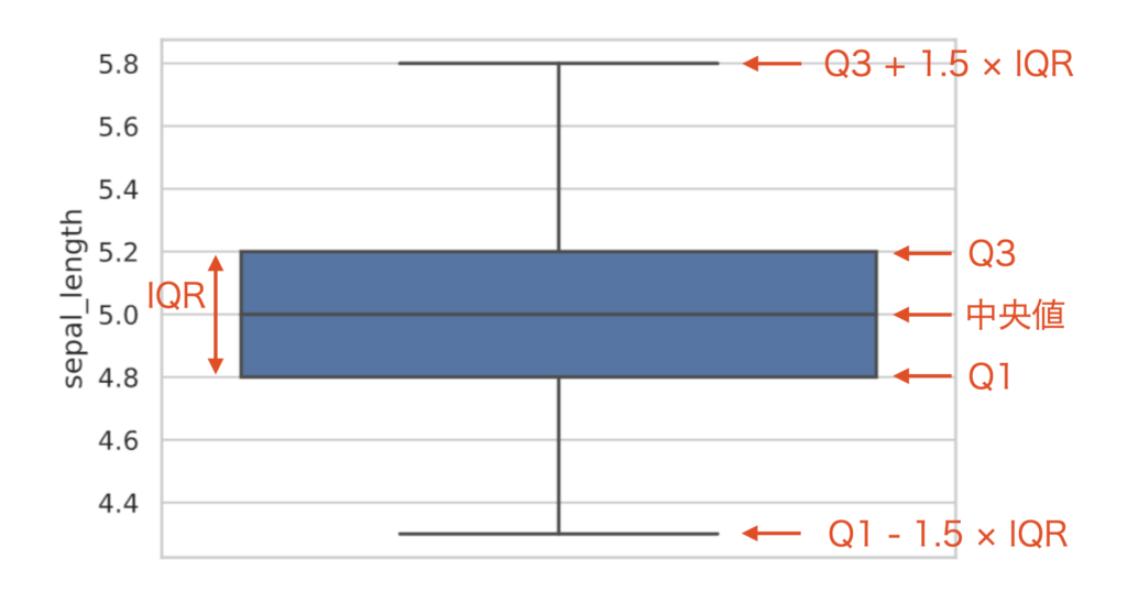
When comparing multiple distributions, it is often easier to understand a box-and-whisker diagram side-by-side than to compare histograms directly.
sns.boxplot(data=df_iris.drop('species', axis=1))
plt.show()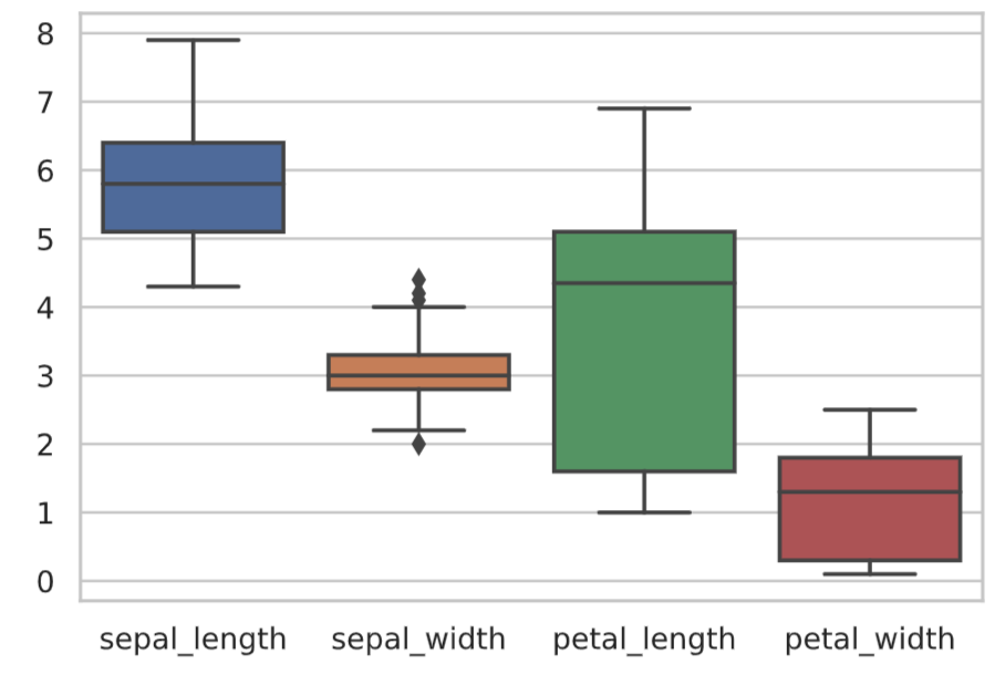
The seaborn library also provides a boxenplot function that extends the box-and-whisker diagram. It displays information on the bottom of the data distribution without dropping it.
sns.boxenplot(data=df_iris.drop('species', axis=1))
plt.show()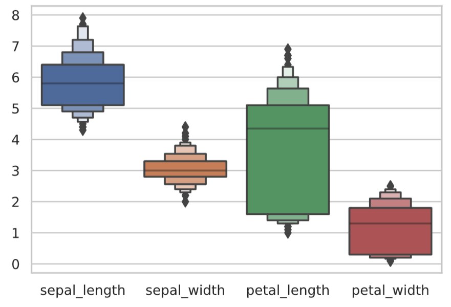
Reference Books
▼ Next: How to handle multivariate data