
の理解-〜実装編〜.jpg)


Introduction
In my previous article, I discussed the theory of principal component analysis. In this article, we will implement Principal Component Analysis using Python.

Also, the following code works with Google Colab.

\begin{align*} \newcommand{\mat}[1]{\begin{pmatrix} #1 \end{pmatrix}} \newcommand{\f}[2]{\frac{#1}{#2}} \newcommand{\pd}[2]{\frac{\partial #1}{\partial #2}} \newcommand{\d}[2]{\frac{{\rm d}#1}{{\rm d}#2}} \newcommand{\T}{\mathsf{T}} \newcommand{\(}{\left(} \newcommand{\)}{\right)} \newcommand{\{}{\left\{} \newcommand{\}}{\right\}} \newcommand{\[}{\left[} \newcommand{\]}{\right]} \newcommand{\dis}{\displaystyle} \newcommand{\eq}[1]{{\rm Eq}(\ref{#1})} \newcommand{\n}{\notag\\} \newcommand{\t}{\ \ \ \ } \newcommand{\argmax}{\mathop{\rm arg\, max}\limits} \newcommand{\argmin}{\mathop{\rm arg\, min}\limits} \def\l<#1>{\left\langle #1 \right\rangle} \def\us#1_#2{\underset{#2}{#1}} \def\os#1^#2{\overset{#2}{#1}} \newcommand{\case}[1]{\{ \begin{array}{ll} #1 \end{array} \right.} \end{align*}
Full-scratch PCA implementation
The data used as an example is the Wine dataset. The Wine dataset consists of 178 rows of wine samples and 13 columns of features representing their scientific properties.
Let’s read the Wine dataset using the scikit-learn library.
import pandas as pd
from sklearn.datasets import load_wine

wine = load_wine()  # Loading the Wine Data Set
df_wine = pd.DataFrame(wine.data, columns=wine.feature_names)
df_wine['class'] = wine.target
df_wine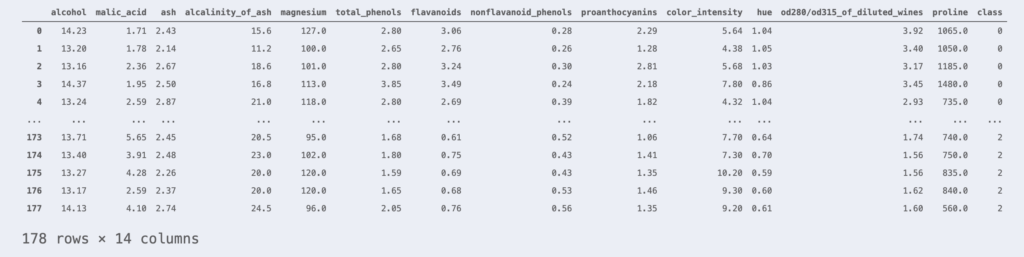
This sample belongs to one of classes 0, 1, or 2. The rightmost column indicates the class to which each sample belongs.
Now, since the Wine data set is 13-dimensional data, it is impossible to visualize its scatter plots. Therefore, let’s try to visualize the data by using Principal Component Analysis to compress the dimensions to 2 dimensions without losing any information.
First, standardize the data as a pre-processing step.
from sklearn.preprocessing import StandardScaler

X = df_wine.iloc[:, :-1].values  # Get non-class columns
y = df_wine.iloc[:, -1].values  # Get class columns
# standardization
sc = StandardScaler()
X_std = sc.fit_transform(X)From the contents of Principal Component Analysis Theory, the problem of “finding a projection axis that loses as little information as possible when projecting data” has been replaced by the following eigenvalue problem.
\begin{align*} S\bm{w} = \lambda\bm{w}. \end{align*}
where $S$ is the variance-covariance matrix of the data.
Therefore, in order to perform a principal component analysis, we must first find the variance-covariance matrix of the data and then calculate the eigenvectors of that matrix.
import numpy as np

# Create variance-covariance matrix
cov_mat = np.cov(X_std.T)
# Create eigenvalues and eigenvectors of variance-covariance matrix
eigen_vals, eigen_vecs = np.linalg.eig(cov_mat)
# Create pairs of eigenvalues and eigenvectors
eigen_pairs = [(np.abs(eigen_vals[i]), eigen_vecs[:,i]) for i in range(len(eigen_vals))]
# Sort the above pairs in order of increasing eigenvalue
eigen_pairs.sort(key=lambda k: k[0], reverse=True)

w1 = eigen_pairs[0][1]  # Eigenvector corresponding to the first principal component
w2 = eigen_pairs[1][1] # Eigenvector corresponding to the second principal componentIn the above code, two eigenvectors are sought for dimensional compression to two dimensions.
The projection by principal component analysis is accomplished by constructing a projection matrix $W$ of eigenvectors in columns and applying it to the observed data matrix $X$ from the right.
\begin{align*} \large \us Y_{[n \times q]} = \us X_{[n \times p]} \us W_{[p \times q]} \end{align*}
Thus, the code for dimensional compression is as follows
# Projection Matrix Creation
W = np.stack([w1, w2], axis=1)
# Dimensional compression (13D -> 2D)
X_pca = X_std @ WThanks to the compression from 13 dimensions to 2 dimensions, the data can be visualized. Let’s plot it.
# Data Visualization
import matplotlib.pyplot as plt

colors = ['#de3838', '#007bc3', '#ffd12a']
markers = ['o', 'x', ',']
for l, c, m, in zip(np.unique(y), colors, markers):
    plt.scatter(X_pca[y==l, 0], X_pca[y==l, 1],
                c=c, marker=m, label=l)

plt.xlabel('PC 1')
plt.ylabel('PC 2')
plt.legend()
plt.show()
The data could be visualized in this way.
Implementation of PCA using scikit-learn
With scikit-learn, it is very easy to perform a principal component analysis.
# Import PCA Library
from sklearn.decomposition import PCA

# Dimensional compression (13D -> 2D)
X_pca = PCA(n_components=2, random_state=42).fit_transform(X_std) # n_componentsは圧縮後の次元数Plotting the dimension-compressed data with scikit-learn’s PCA library, we get the following

The same results were obtained as with full scratch PCA. (Although it is inverted up, down, left, and right……)
You can try the above code here▼.